
Kubernetes

Summary
This case study takes you through the UX design journey of creating a Kubernetes desktop application with a single goal in mind: making life easier for software developers. As the sole UX/UI designer on the project, I worked hand-in-hand with a developer client who wanted to elevate the application's interface and data visualisation. Together, we set out to design a tool that not only looked great but also made managing Kubernetes clusters more intuitive and efficient.
Role 👩🏻
UX/UI Designer - UX Researcher
Timeframe ⏳
3 weeks
Tools 🛠️
- Figma
UI Kit 🎨
Shadcn UI design system
Understanding the Challenge 🧐
The client, a developer with extensive experience in Kubernetes, sought to create a desktop application that would streamline the experience of managing Kubernetes clusters. The main challenge was to design a user experience that provided better data visualisation for software developers.
Solution 🎯
To address the challenges identified, I developed a set of design solutions including:
Dedicated Terminal Window
Dual-Mode Sidebar
Starred Clusters
UX Research 🔎
I conducted a competitive analysis of two major Kubernetes desktop applications: Lens and Octant. Lens offered efficient workflows but suffered from a cramped UI due to the integrated terminal while Octant provided better visualisations but lacked the seamless workflow integration found in Lens. The analysis revealed an opportunity to combine the best features of both applications while addressing their respective shortcomings.

Design Solution💡
Dedicated Terminal Window
One of the primary design innovations was to separate the terminal actions from the main interface. Unlike Lens, which includes the terminal within the same window, the new design opens a separate window for actions.

This decision was made to declutter the main interface, providing more space for data visualisation while still allowing developers to perform terminal actions efficiently. Developers now have a dedicated, full-sized window for terminal actions, which can be moved to a different monitor or screen, thus enhancing multitasking and overall user experience.

Dual-Mode Sidebar
The dual-state sidebar offers a balance between ease of navigation and maximising screen estate, catering to both new and experienced users. This feature allows developers to switch between a detailed view and a minimalist view depending on their current needs, improving overall usability.
Open Sidebar: Displays both the navigation icons and their corresponding labels. This state is ideal for users unfamiliar with the icons or those needing more contextual information.

Closed Sidebar: Displays only the icons, providing more space for the main content and visualisations. This state is optimised for experienced users who prioritise screen space and are familiar with the iconography.
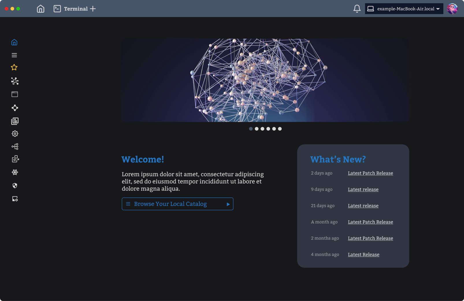
Cluster Starring Feature
To further enhance usability, I introduced a feature that allows developers to "star" their frequently used clusters. This feature provides quick and easy access to the most important clusters directly from the sidebar or a designated favourites section.

Finally, I developed a prototype and delivered the final design to the client along with detailed documentation of the competitive analysis, information architecture, and design drafts.
Prototype (Sidebar closed) Prototype (Sidebar open)
Information architecture

Key Learnings ✍️
Competitive Analysis Provides Valuable Insights: Diving into a competitive analysis of Lens and Octant provided me with valuable insights about the specific pain points of existing Kubernetes desktop applications and where I could innovate.
Flexibility Enhances Usability: The introduction of features like the dual-state sidebar highlighted the value of flexibility in design. Allowing users to toggle between different views based on their preferences or experience level contributed to a more personalised and efficient user experience.
What the client says 💭
I worked with Clara on a side project of mine and she was able to exceed expectations with her deliverable. Although the product I was working on was a bit niche and technical, Clara was able to understand what was being asked and she developed a great UI/UX for my project.