
Web-Based Network Analysis Tool
Summary
This project focused on designing a web-based, open-source network analysis tool that combines powerful analytical features with the accessibility and intuitiveness of modern web design. The goal was to make complex data visualisation and manipulation available through a browser, built on a React UI framework (Mantine), for semi-technical users such as scientists, researchers, analysts, and data engineers.
The product bridges the gap between professional-grade network analytics and approachable, intuitive interfaces. It enables users to explore nodes, edges, and clusters without needing to install heavy software or learn scripting languages.
Role 👩🏻
UX Designer
Timeframe ⏳
3 months
Tools 🛠️
Figma
UI Kit 🎨
Mantine UI
Understanding the Challenge 🧐
Existing network analysis tools such as Cytoscape, Gephi, and Sigma.js offer powerful analytical functions but often at the cost of usability. They are typically desktop-based, rely on Java, and present steep learning curves that discourage new users.
The main challenges were:
- Reducing interface complexity and avoiding unnecessary technical jargon.
- Designing for scalability and collaboration, unlike traditional single-user desktop tools.
- Creating a workflow that supports both non-technical newcomers and experienced analysts.
Solution 🎯
The resulting solution is a web-based network analysis platform built on the Mantine React UI framework, designed to be both powerful and approachable.
Key UX Principles Applied
Object-first approach: Instead of traditional action-first interfaces (where users must choose a tool before selecting data), users interact directly with objects — nodes, edges, and clusters — similar to Figma’s interaction model. This made the experience intuitive and scalable, reducing cognitive friction for new users.
Progressive complexity: Features were revealed gradually, allowing beginners to perform simple visualisations and advanced users to run algorithms or custom queries.
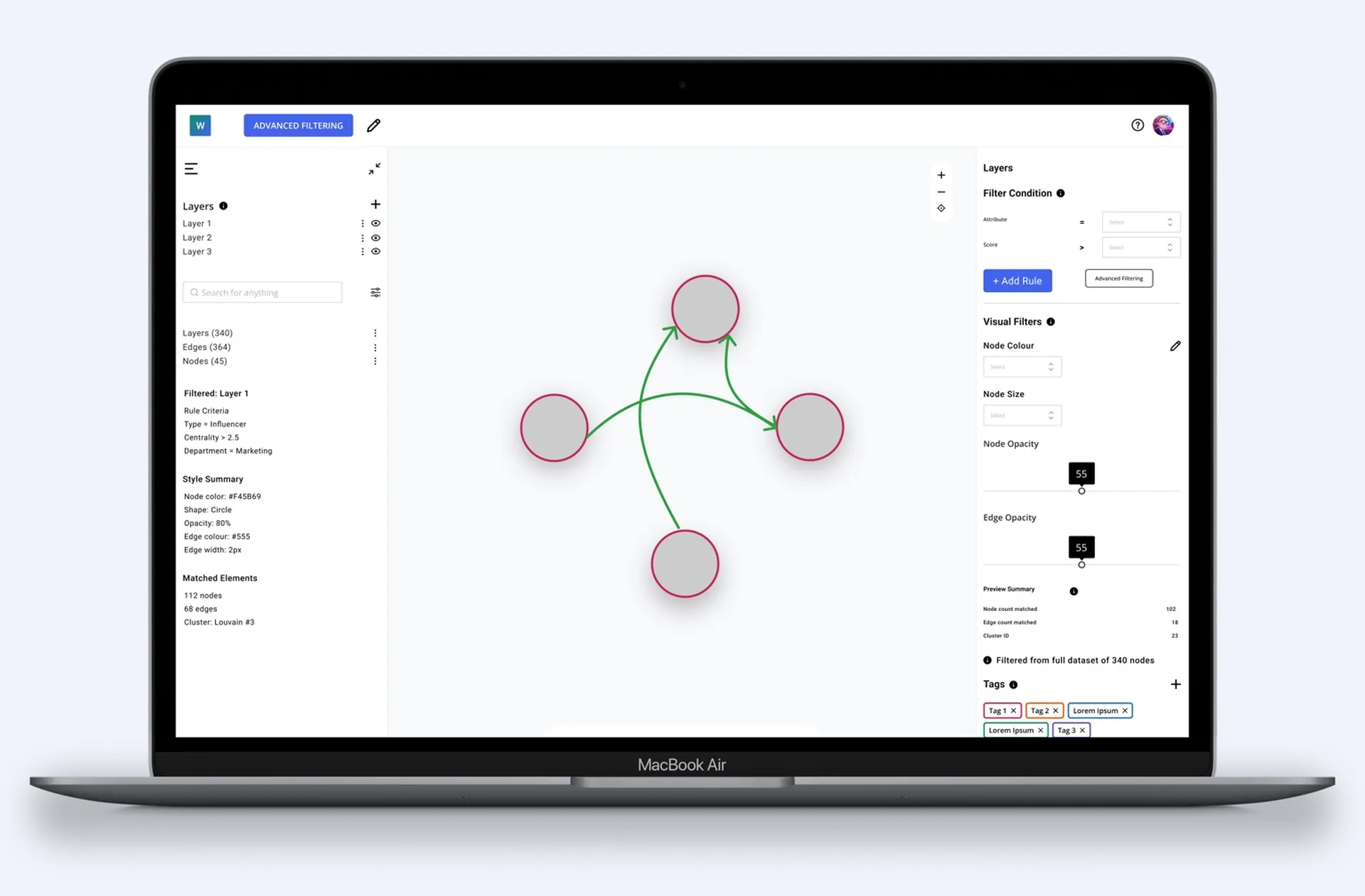
Multi-layer architecture: Networks can be split into layers for comparative analysis — supporting complex analytical tasks in an organised interface.
Accessible UI design: Clear typography, consistent color coding, and structured layouts reduce visual overload for semi-technical users.
UX Research 🔎
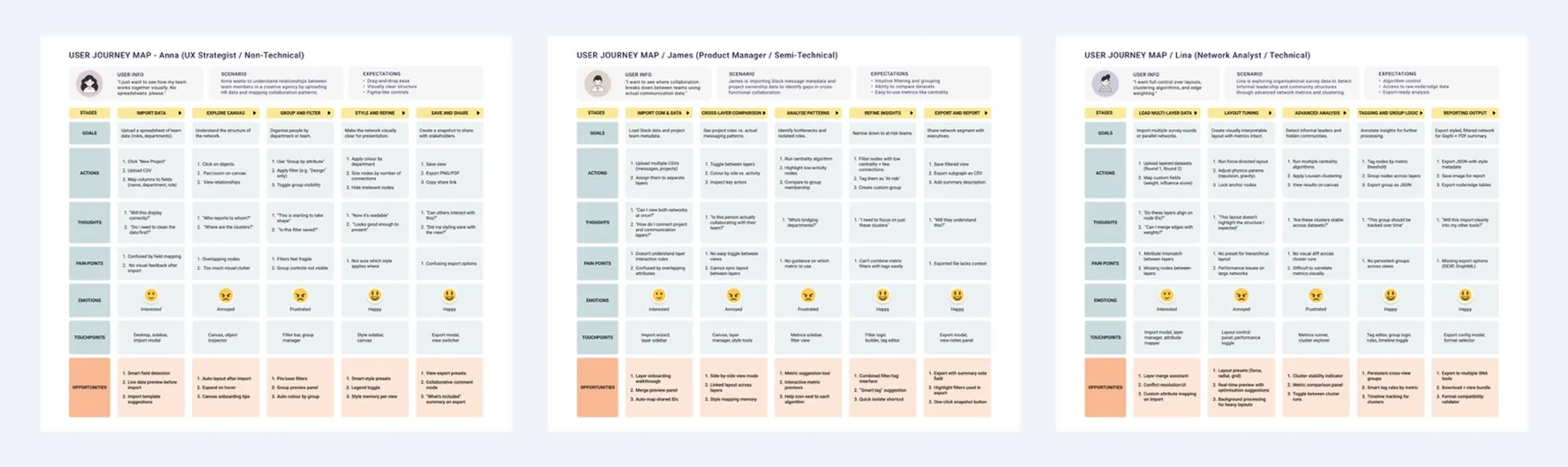
Before starting the design, I conducted a competitive analysis and created user journey maps to understand how semi-technical users interact with existing network analysis tools. The benchmarking focused on identifying what worked well in leading tools and what consistently caused friction. While tools like Cytoscape and Gephi offered advanced analytical capabilities, they often overwhelmed users with dense interfaces and steep learning curves.
From this research, three key insights shaped the design direction:
Clarity matters more than capability – Users value visibility and ease of navigation over having every possible feature exposed at once. The interface needed to feel approachable without limiting power.
Interaction should start with the data, not the menu – Most tools followed an “action-first” model that forced users to search for commands before interacting with objects. I chose an object-first approach, where users could directly manipulate nodes, edges, and clusters — creating a faster, more intuitive experience.
Scalability and flexibility are essential – The design had to accommodate both quick visual exploration and in-depth analytical workflows. This meant planning the interface and architecture to scale with growing datasets and different user skill levels.
To visualise user goals and pain points, I mapped out three key personas — a researcher, a product manager, and a data analyst — and built user journey maps that captured how each approached tasks like loading data, analysing networks, and exporting results. These helped validate the flow and ensure the design supported both exploration and efficiency.
Design Solution 💡
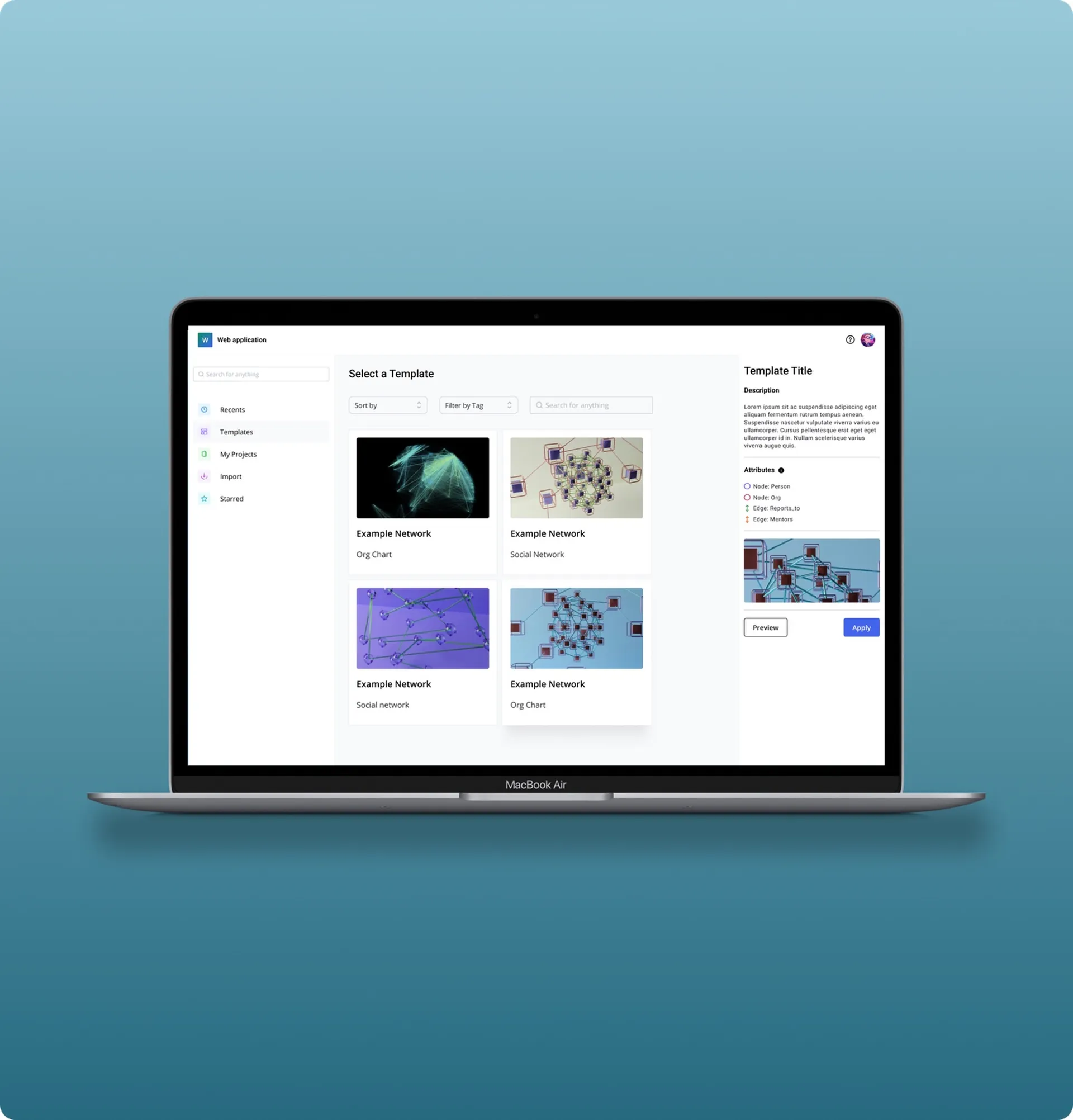
From Structure to Clarity: Low-Fidelity Wireframes and Information Architecture
The design process began with low-fidelity wireframes and a clear information architecture to define the foundation of the tool. These early layouts focused on navigation flow, feature grouping, and user task prioritisation - ensuring that both non-technical and advanced users could easily find the functions they needed.
The wireframes helped validate how different components — such as the network workspace, filtering system, and analytics panels — would interact. Once the structure felt intuitive and efficient, the project transitioned into high-fidelity design, refining interface hierarchy, interaction states, and visual consistency using the Mantine React UI framework.
Layout and Interaction Design
The final layout was designed to create balance between clarity and analytical power.
The left-hand sidebar provides quick access to essential controls, such as layers, nodes, edges, and filtering options, allowing users to navigate or modify their network view effortlessly.
The right-hand sidebar is contextual and dynamic, adapting its content based on user interaction — for example, displaying node details, metric results, or customisation tools depending on what’s selected on the canvas.
This structure minimises cognitive load by ensuring users always see only the relevant tools for their current action, reinforcing the product’s object-first interaction model.
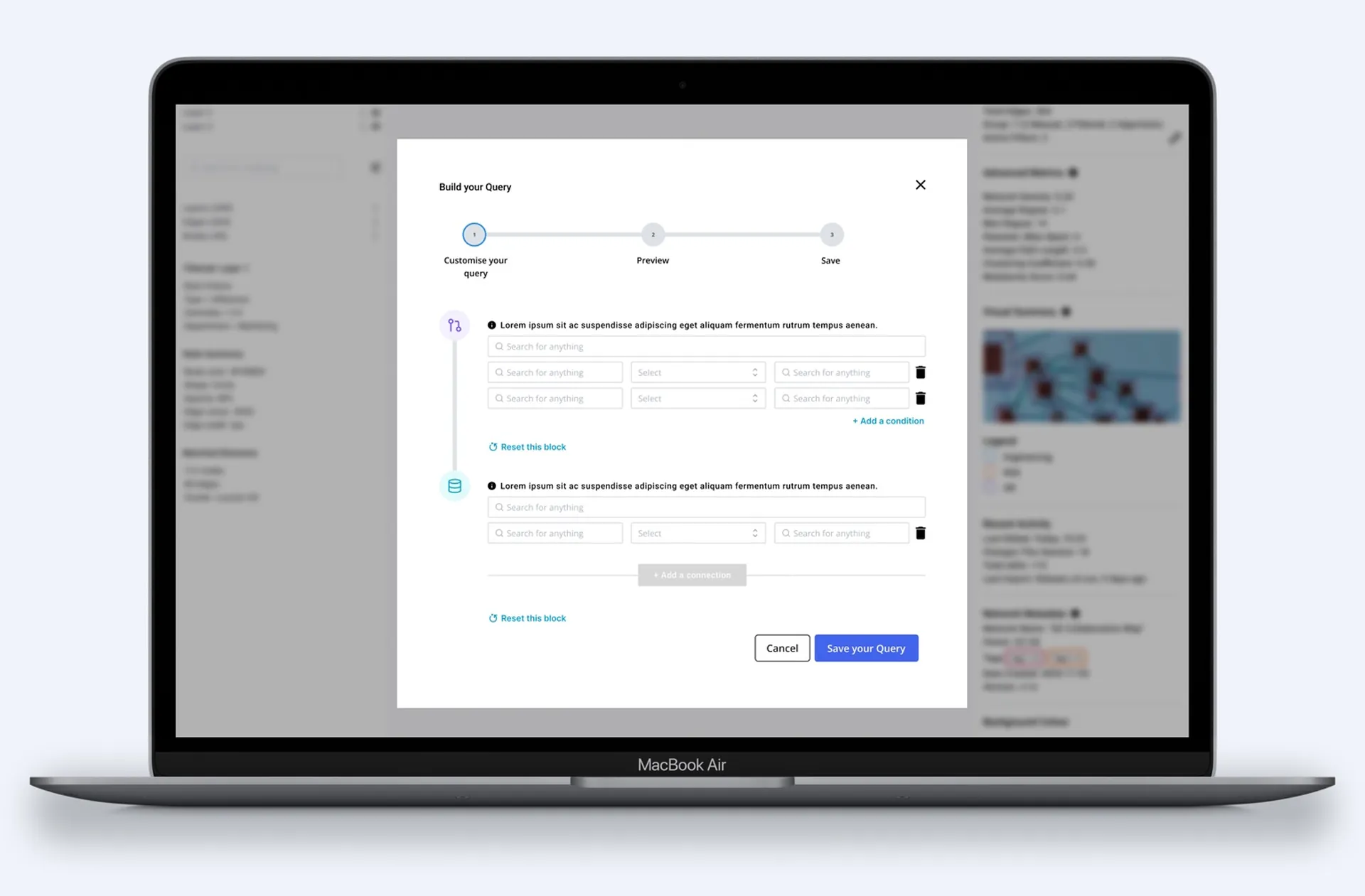
Advanced Filtering and Query Building
For more technical users, the design includes a dedicated advanced filtering space that supports query building and custom analytical operations.
This allows experienced analysts and data engineers to harness the full potential of the tool - performing attribute-based filtering, running algorithms, and refining networks with precision.
While new users can explore and visualise data through straightforward panels, advanced users gain access to deeper analytical control, ensuring the platform serves both entry-level exploration and expert-level research.
Key Learnings ✍️
Accessibility drives adoption
One of the most valuable outcomes of this project was understanding how accessibility directly impacts adoption in complex analytical tools. By simplifying the interface and reducing unnecessary technical language, the product became approachable to a wider audience — from data analysts to researchers without a coding background. Lowering onboarding barriers encouraged exploration, helped users gain confidence faster, and ultimately improved retention and engagement.
Object-first design outperforms toolbars
Transitioning from an action-first to an object-first model fundamentally changed how users interacted with the system. Rather than navigating through menus or toolbars to trigger functions, users could interact directly with data elements — nodes, edges, and layers — in real time. This interaction model significantly reduced learning time and cognitive load, making complex operations feel intuitive. It reinforced how interaction design can bridge the gap between simplicity and advanced functionality when implemented thoughtfully.